


RESTAURANT
RESCUE PROJECT
The Restaurant Rescue Project (RRP) is a New Haven based organization that seeks to reallocate food waste and combat local hunger. Partnering with local restaurants and markets, they transport food to soup kitchens and shelters.
Volunteers must not only transport the food but also ensure that everyone knows where to go and when. My challenge was to design an on-the-go solution to make that task seamless.
CONTENT
AUDIT
INFORMATION
ARCHITECTURE
WIREFRAMES
MY PROCESS
(click on the boxes below
to skip to a section)
STAKEHOLDER INTERVIEW
For my stakeholder interviews, I met with a group of RRP admins and volunteers to discuss some general problems they identified.
According to them, the organization was being coordinated through a clumsy combination of disjointed messaging services, spreadsheets and mouth-to-mouth interactions, leaving a lot of room for mistakes. Their request was for
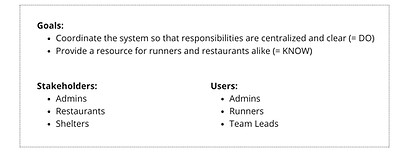
a centralized system that would make RRP more orderly, efficient, and transparent.
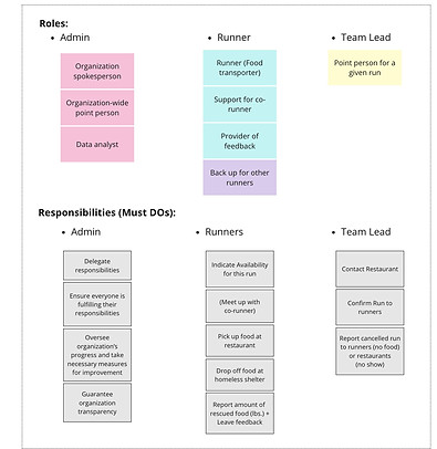
Together we broke down organization's structure in order to have a clearer vision of what we had to work with; from that, we outlined the main goals for the project.
When discussing what form the project might take, the fact that most RRP volunteers would need access on-the-go lead us to agree on a phone app as the most fit solution.
Many other requests and ideas came up in that meeting, and the next step was consolidating everything in the form of a feasible plan.
USER FLOW
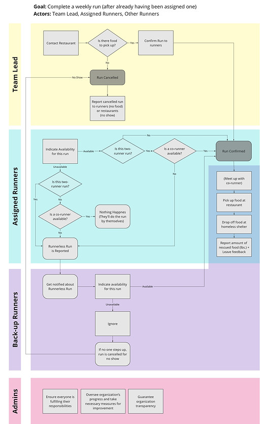
Tracing the flow for RRP's food transportation process provided many valuable insights regarding what could be improved; but more surprisingly, it shed a light on what might be better to keep the same.
For instance, during the stakeholder interview some of the admins suggested that the app should be able to eliminate the middleman role of 'lead', allowing runners themselves to contact restaurants and confirm runs.
However, as I attempted to plot a flow without any leads conflicts kept arising: if a runner had to cancel, would they still be responsible for contacting the restaurant after? On the flip side, if they were to contact the restaurant first and then had to cancel, would that provide enough time to find a backup runner (given that restaurants must be contacted 24h ahead).
In text form, these questions may seem convoluted and unintelligible, but they became strikingly clear the more I tried to get the user flow to be perfectly self-enclosed. After a lot of shuffling around, it became apparent that the 'lead' role was a necessary one; still, although the app couldn't completely eliminate it for now, it could help make it as effortless as possible.
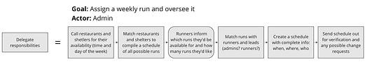
Beyond the Scope
Another insight was realizing that an entirely different user flow was necessary for the delegation of responsibilities at the beginning of the semester before runs effectively begin. This was agreed to be beyond the scope of the project for now, but I still drafted a suggestion anyway (displayed on the right).
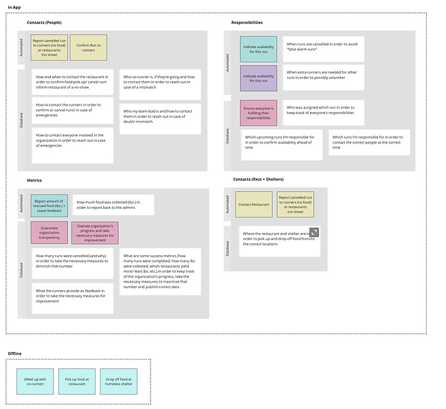
CONTENT AUDIT

The goal of the app (as defined in the stakeholder interview) was to not only be an active coordinating system for member responsibilities (the Must DOs) but also a general resource for the organization (the Must KNOWs).
Before deciding which pieces of information (Must KNOWs) should be automatized in the user flow and which should exist in static form around the app, I brainstormed any and all information that could be included in the app, then consolidating whatever arose - a content audit of sorts.
Next, I linked all the information (Must KNOWs) to either a role (Must BE) or a responsibility (Must DO) (or both). These links provided an insight as to which information was truly useful and which was actually superfluous (by having no links and therefore not serving any of the project's predetermined needs or goals).
The final product was an exhaustive catalog of what should be included in the app. Now all that was left was figuring out how these items should be grouped and organized.
INFORMATION ARCHITECTURE
Must Dos
(Responsibilities)
Must Know
(In order to do...)
Must Be
(Roles)
The items outlined in the content audit fell pretty organically into 3 main categories: Responsibilities, Metrics and Contacts. The last was then further divided into 2 sections - People vs. Restaurants+Shelters - since these were expected to be pretty content heavy themselves.
Within each category I then divided the items according to whether they were pressing enough to be pulled up straight into home page (i.e. automated) or whether they could be stored somewhere else around the app in static form (i.e. database).
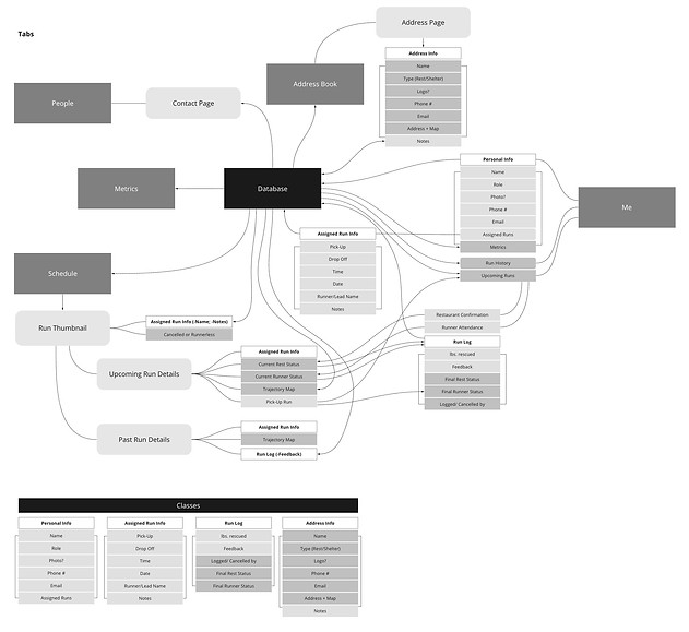
These categories informed what tabs I would want to create on the app - which I tried to keep to a maximum of 5 based on apps whose navigation I enjoy, like Depop and Instagram. For the 4 categories, each database part became a tab of its own (namely 'People', 'Address Book', 'Metrics' and 'Schedule'). The automated parts all joined together to form the run-coordinating home page ('Me').
The diagram to the right is an information architecture of sorts, with the 5 main tabs in dark gray, the tentative sub-tabs in the rounded light gray boxes.
The idea was to make the app as self-sufficient as possible, without much need for admin input. Therefore, items were grouped using object-oriented design, with white boxes representing classes and arrows illustrating the connections between all of the pieces of data present inside the app.
From the connecting arrows I was able to gather that some loose ends had to be resolved. For instance, the run schedule page would be populated by pulling everyone's individual assigned runs - but who would input everyone's assigned runs? I had some ideas, but these were conversations I'd have to bring forward to the developers and stakeholders before proceeding.
WIREFRAMES

Using my information architecture diagram as a guide, I sketched out wireframes, first on paper then on Axure RP 9 to get a better idea of smartphone proportions.
Since my wireframing started before I could clear out the queries mentioned above, I created designs with the in-app-input scenario in mind (where assigned runs and other inputs are made through the app, not through an external source).
The 'Me' page was where all the information labelled 'automatic' in the information architecture went. The information labelled 'database' was then spread across the rest of the tabs.
The 'Runs' and 'People'/ 'Address Book' pages were based off of Apple standards, like the iPhone Calendar and Contacts apps, respectfully. The 'Metrics' page was left mostly blank since we had yet to define what data the stakeholders would prefer to see in there.
MOVING FORWARD
The project reached a hiatus once the team's main developer had to drop out. I was left without much more to move forward with; however, were we to have continued, I planned to:
-
collect more information on how to proceed regarding the in-app vs. external source question
-
test the clickable wireframes on runners and admins alike
-
integrate my findings into higher-fidelity, styled wireframes
My key takeaways, were:
-
developing my own design process and presentation style (which I repeated for my other project, the STC Scheduler)
-
learning how to better document my thought process
-
understanding when to keep planning vs. when to dive into deliverables (given that there were a whole set of wireframes that I sketched early on and entirely tossed out)