AGTECH START-UP*
Aug 2020 - Jul 2021
Role
UX/UI/Product Designer
Scope
Product Design,
User Research,
Design Documentation
Tools
Figma, Miro, Notion
Summary
This start-up is aiming to revolutionize agriculture through innovative SaaS solutions. I worked alongside PMs and software engineers to develop unique digital products from research to implementation.
Below, I go in-depth into part of the start-up's mobile app, with which I was most involved during my time there. I worked in a team of 5 as the sole designer alongside a PM and three software developers.
* The start-up has asked to be kept anonymous for this case study.

PROJECT BRIEF
The User
Agronomists are like 'farm doctors', visiting their farm clients regularly to make sure the land is healthy for crops to thrive.
Similar to regular doctors, agronomists reach diagnosis using a variety of tools, such as visual observations, lab examinations, and inferences based on history. Then, they report back to the client, who can take the appropriate measures.
.png)

Their Problem
Unlike regular doctors, agronomists require 'deskless' tools to visit their remote client farms. This often means a combination of several apps and analog notes, generating scattered information which they scramble to consolidate.

.png)
Our Challenge
This start-up is working to provide all of the information an agronomist could need about their client in one software.
I had the challenge of designing a mobile app that supports data collection out in the field and integrates it into web software to be quickly consulted, shared, and stored.
At the time, my Product Manager decided to kickstart this ambitious project with a simple tool for soil sampling: a process that consists of an agronomist collecting samples, sending them to a lab, and then plotting the lab results onto a map for a geographic view of the land's quality.
Our soil sampling tool aimed to eliminate that last part of that process; as samples are categorized and geolocated during collection through the app, our software can then automatically generate maps from that data more quickly and accurately, storing them for future use too.
.png)
DESIGN PROCESS
Getting started
Given how little I knew about agriculture coming in, my first step was to immerse myself in that world, reading books, online blogs, watching videos, researching the competition, chatting with coworkers, etc.


I met online with Adolfo, a real farm manager, to collaboratively map out a typical soil sampling process as-is, including all of the agents involved and the tools used.
Some challenges Adolfo pointed out were not having signal in the field and losing/mixing samples when sending them to the lab.
(Click to expand)

Exploration
I worked with my project manager to map out a soil sampling process to-be with our app.
From that, I used components from a previous App to create a first draft screen flow.

Design challenge
One issue Adolfo brought was: how do we accurately map the samples collected? Digitally keeping track of real-world touchpoints is always a challenge.
My PM held a company-wide meeting to harvest ideas. People suggested shipping sample bags with trackable IDs, sending printable QR codes to put inside the bags, among other ideas deemed logistically unfeasible.
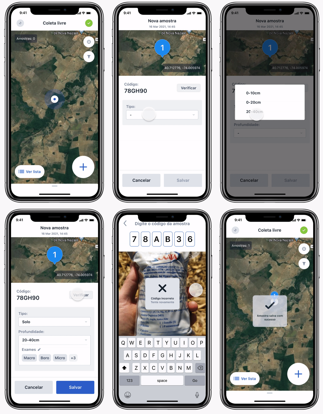
My suggestion was a two-step verification process, where:
1. When a user collects a sample and "adds" that sample in the app, a code is automatically generated.
2. The user writes that code in whatever bag they're using — alongside other information they routinely write.
3. Then, they confirm that code in the app again.
.png)
Samplers are forced to confirm the code by reading from the bag itself, that way ensuring legibility.
This idea introduces a new workflow into materials and processes already in use, therefore requiring minimum logistics.
Iteration
My next step was to run my sketches by Adolfo and some coworkers to get feedback and iterate.
Some of the points raised were:
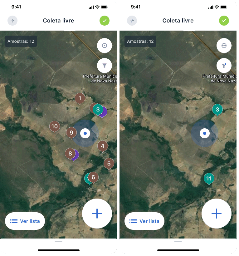
Filter
Sometimes many types of samples are taken from the same spot — each is its own sample, with its own bag. That would make the pins in the map overlaid and messy in the app
So I added a filter feature to separate samples by type and still allow users an overall geographic view of their work.


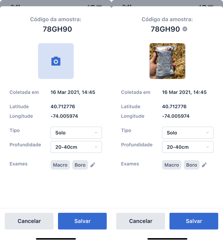
Verification
Verifying every sample during collection can slow down the workflow and become tiring. For other sample information, samplers tend to fill out the basics out in the field and then fill out the rest later elsewhere.
So I made verification no longer a requirement for registering a sample. Instead, a “verified” badge would showcase an extra layer of security that could be claimed at any time.


As I iterated upon this and other feedback, I approached a version of the app that fulfilled our user needs. However, all of the last-minute add-ons and changes made the design clunky.
So I took a step back to rethink the overall visual hierarchy and polish my hi-fi design.
Working remotely prompted me to start sketching with Figma UI components right away, since it would be much harder to share hand-drawn work. Looking back, that made everyone distracted by the visuals instead of really focusing on the user flows. Next time, I should take the time to explore in a more lo-fi setting even if that means more work.
My final design displayed all of the same information in a more visually diverse and appealing way.
.png)
Observations
The important concept should be "verify" not "photo"
Focus less on automated information (date and time)...
... and more on where users must interact
-
Include a map view instead of lat, long numbers
-
Include sample number/pin

Hand-off
Finally, I took a series of measures to expedite the upcoming development process and avoid any guesswork on their end.

1
I communicated frequently with developers during the design process to ensure my ideas were feasible and comprehensible.
2
I made sure the screens were built out of components specified in our growing design system.
3
I included information boxes in the hand-off page to provide further clarifications.

4
I created a prototype to outline the user flow and the accompanying animations.
TAKEAWAYS
As tends to happen in fast-paced start-ups, this project was reprioritized to be developed later, so I wasn't able to see its final form during my time at this start-up.
However, we ended up working instead on an even simpler note-taking tool that used many of the same layouts and components I created for this project, so a lot of the work done here proved useful.
For the note-taking tool, we ran a series of user interviews and got a lot more feedback. I was surprised at how much the users already enjoyed the designs, and that gave me more confidence they'll enjoy this upcoming soil sampling tool.
In this project I learned about:
My own process and work pace
-
I found out I really enjoy running workshop-like meetings to inform my designs in their early stages — and I found people enjoy it too.
-
I got better at giving my PM estimates for completion and describing what I’d deliver.
How to communicate with developers
-
I devised my own hand-off process and materials based on conversations with my coworkers about what they’d find helpful.
-
I tried to create opportunities for developers to pitch in by inviting them to ‘workshops,’ holding ‘office hours’ and being present in their daily meetings — given that they tend to not be the most proactive communicators.

