TNTP TEACHING FELLOWS
Apr 2022 - Sep 2022
Role
UX Designer
Scope
Sitemapping, Wireframing
Tools
Miro, Figma
Summary
TNTP Teaching Fellows was one of my first projects at Radish Lab, a design agency specialized in working with purpose-driven organizations. The project involved revamping the TNTP Teaching Fellows' website.
My task was to pick-up from research carried out months prior, create wireframes for all pages, and then hand those off to UI designers. I had frequent meetings with the clients to gather feedback and iterate upon it. Here's the final published site.

PROJECT BRIEF
The TNTP Teaching Fellows program offers an affordable, faster path to teacher certification. However, their website's outdated look and feel was getting in the way of new candidates applying.
My task was to restructure the site in order to facilitate conversions; I was paired with a UI Designer, who worked on a new visual identity to be applied to the wireframes I delivered.
DESIGN PROCESS
Getting started
Coming into this project I was given a research deck including personas and their goals, and a rough draft of a site map with suggested pages and sections in no particular order.
My task was to take it from there.
According to the research, several alumni reported not having understood clearly what the program entailed before applying, which at times hindered their experience.
For that reason, we agreed it would be best if we focused on funneling users into the information relevant to them rather than pointing them straight to applying.
Sitemap
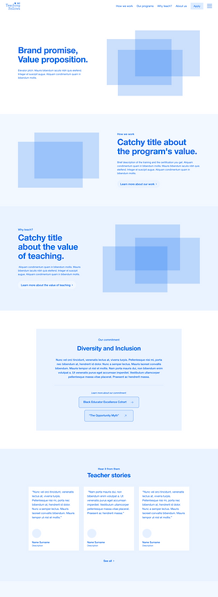
In order to funnel users into the information relevant to them, I designed a sitemap that allowed for a lot of horizontal navigation and directed the traffic towards “Our Programs”, a page which contained program-specific information.

(I color-coded repeating sections to communicate to the developers when to reuse components.)
Wireframes
Next, I created wireframes for each page, including guidance for what type of content should go in each section.
![2.1 [Program] hompage.png](https://static.wixstatic.com/media/14ea1c_c90262ac95bb4f73887acd592e1a22d9~mv2.png/v1/crop/x_0,y_0,w_1440,h_4072/fill/w_302,h_855,al_c,q_85,usm_0.66_1.00_0.01,enc_avif,quality_auto/2_1%20%5BProgram%5D%20hompage.png)

These wireframes went through various iterations based on feedback sessions with clients. Once finalized, they were handed off to the UI Designer, who incorporated color, imagery, and typography.
One thing I learned from this project was that I should have gotten feedback on the nav bar only, before talking about page content. While we had feedback sessions about the sitemap, it only became truly tangible to clients once it manifested in the nav bar — and then they had tons to say.
TAKEAWAYS
It was a huge joy working with clients who are making a difference. The website went live just a few months after, just in time for new candidates to apply and start their journeys towards becoming future teachers.
In this project
I learned about:
Client education
-
Because Radish Lab works mainly with NGO clients who aren't particularly tech savvy, getting feedback involves a lot of education around the web development and design process, and the more clients I talked to, the better I got at it.
Juggling projects
-
At a busy agency such as Radish Lab, I often had to work on multiple projects at once. In this case, I was devoting my attention to at least 2 other projects at any given time. I had to manage my time wisely and communicate well with PMs.

